How to become a data scientist, part 2: try to solve the problem
Posted on Thu 15 June 2017 in data science
Once you start trying to solve your problem, things are finally moving.
- Get the data.
- Clean the data.
- Look at the data.
- Summarize the data.
Get the data
“80 percent of time spent is preparing data, 20 percent complaining about the need to prepare data.” — A random blog
Why this is so costly deserves its own post. Instead, here is quick advice for a budding a data scientist.
Be precise about what the data means. This usually means asking people, reading code, reading documentation, and looking at distributions of the data. For example, how often a field has a value. A common example of an overly trusting nature is to see a user field called “age”, say, “Ah, the user’s age” and immediately plug it into another system (say, a model builder). But perhaps that field only started being filled in a year ago, or only on certain platforms, and is often blank. What’s worse, blank in a biased way (old users don’t have a value, users on certain platforms don’t have a value). Or perhaps “age” is how long they’ve been a user, i.e. not what you think. To discover these things, talk to people and look at the data. You have to talk to people, because sometimes they know. But, you have to look at the data because sometimes they lie (intentionally or not).
Learn SQL. Tons of data is stored in relational databases, accessible via SQL. Tons more is in Hive, accessible via HiveQL, which is extended, modified SQL. Even with text files, you will use the concept of a table (fixed named columns, and rows).
For text, use tab-separated values (TSV) files. They are easy to read and write, exported from many places, easily pasted into google spreadsheets or Excel for sharing.
For simple tasks, process them with the UNIX command-line. UNIX has been my friend longer than most people, since about 1990. I still do this all the time to get top 10 most common things:
cut -f5 -d”\<tab>” foo.tsv | sort | uniq -c | sort -rn | head -10
Don’t scrape? Sometimes the data you want is on a public website. People write scrapers to grab it. This is practical and useful, but I don’t love it. It may be stealing, I don't really know. I'd actually like to understand this grey area better. It is common. Anyway, better if you can find a permitted source.
Clean the data
All my cleaning is manual, during analysis. This may be bad. I’m being honest.
I look at examples of data records, and summarize the data. If a few things look weird (e.g., lines with the wrong number of fields, mangled text), I remove them. However, don’t remove much or in a biased way.
As an example of bias, if 20% of the records have a field “type” that is empty, those are likely not random, they are a certain type of data. Maybe the most important data. You can’t just pitch them. For records with unknown field values (e.g., type empty, type “NULL”) I usually leave them in (labeled “NULL” or “empty”), to present the mysteries to anyone watching.
Another example is a well-formed data record that is an outlier. How satisfying to pitch it and make your results easier to graph, easier to understand. As an example, here is a post of career points and games played of professional hockey players:

There is one huge outlier at the top. Should we pitch it?
That’s Wayne Gretzky, nicknamed “The Great One” at the age of 10. He’s so famous my browser knew to correct Gretsky to Gretzky. Reddit says, “Wayne and his brother Brent hold the NHL record for most points scored by a pair of brothers. Wayne has 2857, and Brent has 4.” I know nothing about hockey, but his story is inspiring: he was not big, strong or fast; he shattered every record through creativity, practice, team play.
How easy to throw away one point, but we might throw away Gretzky. We can learn a lot from such a point.
Look at the data
People are amazing visual pattern matchers.
Here is an example dataset: X mean 54.26 standard deviation, Y mean 47.83 standard deviation 26.93, correlation of X and Y is -0.06.
Don’t know that one?
Here is the full data (142 lines):
x,y
55.3846,97.1795
51.5385,96.0256
46.1538,94.4872
42.8205,91.4103
40.7692,88.3333
38.7179,84.8718
35.641,79.8718
33.0769,77.5641
28.9744,74.4872
26.1538,71.4103
23.0769,66.4103
22.3077,61.7949
22.3077,57.1795
23.3333,52.9487
25.8974,51.0256
29.4872,51.0256
32.8205,51.0256
35.3846,51.4103
40.2564,51.4103
44.1026,52.9487
46.6667,54.1026
50.0,55.2564
53.0769,55.641
56.6667,56.0256
59.2308,57.9487
61.2821,62.1795
61.5385,66.4103
61.7949,69.1026
57.4359,55.2564
54.8718,49.8718
52.5641,46.0256
48.2051,38.3333
49.4872,42.1795
51.0256,44.1026
45.3846,36.4103
42.8205,32.5641
38.7179,31.4103
35.1282,30.2564
32.5641,32.1795
30.0,36.7949
33.5897,41.4103
36.6667,45.641
38.2051,49.1026
29.7436,36.0256
29.7436,32.1795
30.0,29.1026
32.0513,26.7949
35.8974,25.2564
41.0256,25.2564
44.1026,25.641
47.1795,28.718
49.4872,31.4103
51.5385,34.8718
53.5897,37.5641
55.1282,40.641
56.6667,42.1795
59.2308,44.4872
62.3077,46.0256
64.8718,46.7949
67.9487,47.9487
70.5128,53.718
71.5385,60.641
71.5385,64.4872
69.4872,69.4872
46.9231,79.8718
48.2051,84.1026
50.0,85.2564
53.0769,85.2564
55.3846,86.0256
56.6667,86.0256
56.1538,82.9487
53.8462,80.641
51.2821,78.718
50.0,78.718
47.9487,77.5641
29.7436,59.8718
29.7436,62.1795
31.2821,62.5641
57.9487,99.4872
61.7949,99.1026
64.8718,97.5641
68.4615,94.1026
70.7692,91.0256
72.0513,86.4103
73.8462,83.3333
75.1282,79.1026
76.6667,75.2564
77.6923,71.4103
79.7436,66.7949
81.7949,60.2564
83.3333,55.2564
85.1282,51.4103
86.4103,47.5641
87.9487,46.0256
89.4872,42.5641
93.3333,39.8718
95.3846,36.7949
98.2051,33.718
56.6667,40.641
59.2308,38.3333
60.7692,33.718
63.0769,29.1026
64.1026,25.2564
64.359,24.1026
74.359,22.9487
71.2821,22.9487
67.9487,22.1795
65.8974,20.2564
63.0769,19.1026
61.2821,19.1026
58.7179,18.3333
55.1282,18.3333
52.3077,18.3333
49.7436,17.5641
47.4359,16.0256
44.8718,13.718
48.7179,14.8718
51.2821,14.8718
54.1026,14.8718
56.1538,14.1026
52.0513,12.5641
48.7179,11.0256
47.1795,9.8718
46.1538,6.0256
50.5128,9.4872
53.8462,10.2564
57.4359,10.2564
60.0,10.641
64.1026,10.641
66.9231,10.641
71.2821,10.641
74.359,10.641
78.2051,10.641
67.9487,8.718
68.4615,5.2564
68.2051,2.9487
37.6923,25.7692
39.4872,25.3846
91.2821,41.5385
50.0,95.7692
47.9487,95.0
44.1026,92.6923
Still don’t recognize it?
Okay, here’s a graph:
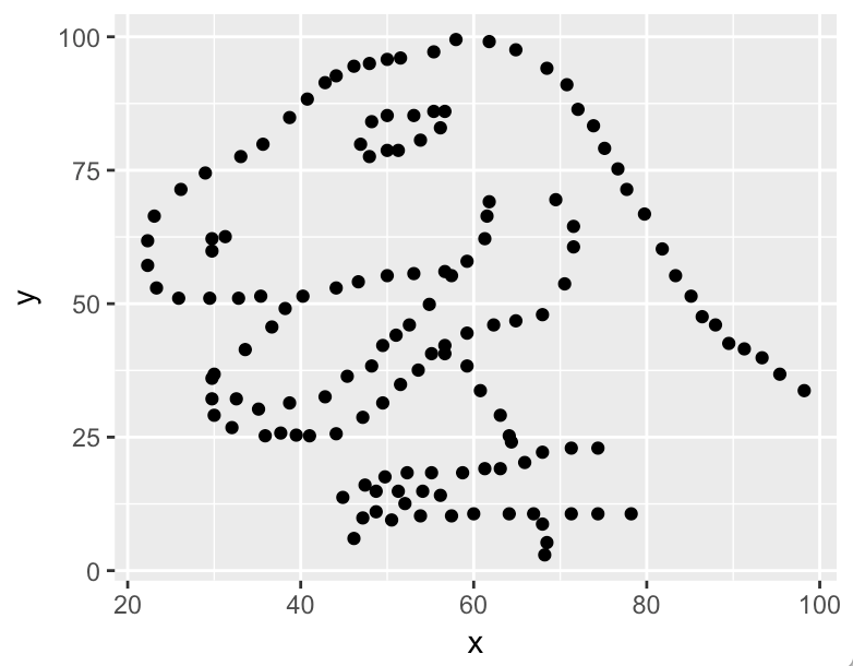
Yep, it’s Alberto Cairo’s Datasaurus, who’s been making the rounds on the Internet, telling us to look at the data. (This is the whimsical version of Anscombe’s quartet, created in 1973 to the same purpose: same stats, different data.)
Computer researchers (I’d say data scientists) took the concept further, showing how to mutate any dataset to different shapes with nearly the same summary statistics using simulated annealing.
The point is, look at the data.
In the case of Datasaurus, we’re done. It’s a dinosaur. Looks like T-rex to me, that can bite down with 8,000 pounds of pressure and make bones “explode.” Do we need more analysis?
Summarize the data
Get insight or value from the data. This involves summarizing it in a useful way: either descriptive (“It’s a T rex”) or predictive (given an input, predict whether it’s a T rex, or maybe what it is). Both are useful. Both are data science tasks.
(Finally, what people think of as data science, and this section is both too long and not detailed enough! I sympathize, but I’m aiming for a quick tour.)
Descriptive analysis
One common technology is a probability. A probability is often
(number of interesting things) / (number of things)
A lot of data science is counting, and learning how to deal with counts.
Get good at defining “number of things” precisely. Counting starts with thinking. When thinking about solving a problem, try defining a probability.
A big advantage is that people are pretty comfortable with thinking about probabilities: “80% of \<things> are \<interesting things>”, and “the chances of \<interesting things> are rising”, and “our goal is at least 75% \<interesting things>.”
In fact, they are too comfortable. They are almost entirely uninterested in uncertainty (i.e. “80% plus or minus 10%”), but it’s important.
In real applications, you have to deal with low counts, i.e. lack of data. When you divide by a low count, you get a noisy probability. Even with “big data”, often you’re interested in only a part of it. Example: One way to recommend content is to predict the probability for each item that someone will engage with it (closeup, buy, ..) after looking at it, and sort the high probability items to the top. If only one person looked at that thing, and they engaged, the probability is 100%. So, if you sort by that probability, tons of unpopular things will shoot to the top. But the probability is not precisely 100%, there’s uncertainty. In this case (a single view), a lot. What to do?
The easiest thing to do is pitch any conclusions without enough data (in this example, without enough views). Judging “enough” is art, not science. How many views are enough? I’d love to see more practical discussion of this art. I think most practitioners just pick something. Some people get more formal, and it’s complicated.
Instead of pitching data, you can keep it but state uncertainty with a confidence interval. A thousand times I’ve used a (normal approximation of a) confidence interval for a binomially distributed random variable: 1.96 * sqrt(p*(1-p)/n), where p is the probability, n is the number of observations, and 1.96 is a multiplier that gives you a 95% confidence interval. (That says, roughly, that if you were to run a similar experiment 100 times, 95 of them would have a probability within the interval you calculated.) There are a ton of assumptions that go into this tool, which means it can be misused. In fact, in the case I mentioned, p=1, so the interval will be 0, which is obviously wrong. In fact, I think Bayesians would claim this formula is always wrong, because you have a prior belief in the probability that is not being used appropriately. I’m going to skip a full discussion, it’s too long. In short, learn about probabilities, binomially distributed random variables, and confidence intervals for them.
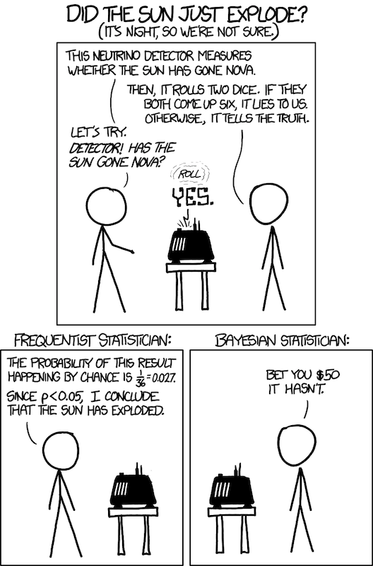
Another way to state uncertainty is with a hypothesis test, i.e. a statistical test of a hypothesis (an assertion), such as, “The probability someone will engage with this content after seeing it is higher than average.” One way to run such a test is to compute a p-value, popularized by Ronald Fisher. Statisticians may get angry at my over-simplification, but a p-value is roughly “the probability that a result occurred at random.” So, you can say, “The probability someone will engage with this content after seeing it is higher than average, p=0.01” meaning “with a 1% chance that this conclusion was actually random noise.” Statisticians call this a “type 1 error” (I never remember type 1 or 2, I prefer “false positive”), and further draw a cloak of invisibility around themselves with the phrase “incorrect rejection of a true null hypothesis.” The point is, if you wish to draw a conclusion, putting a p-value on it is a first step towards dealing with uncertainty. Smaller is better, because then your conclusion is less likely random noise. Fisher proposed that p\<0.05 be considered significant, and people have used that ever since, although it is unclear if he would be happy with how that idea played out.
One huge issue is p-value hacking: people run different studies, analyze different ways, look at different data, and whenever something shows up with p\<0.05, they use (or publish) the result. My friend John Riedl used to joke that 1 in 20 conclusions (that use p-values) in scientific papers is random noise. Ha ha, only serious. It gets worse if you apply humans to the problem, since they have strong incentives to publish results, or to reach conclusions they already believe. There is a lot of controversy over p-values.
Several thoughts. First, at least a confidence interval or p-value represents a sanity check. It helps to quickly throw away a lot of garbage conclusions that people make from graphs with no sign of uncertainty or amount of data. Second, any single quantitative conclusion is a part of a larger story. If you want to be more certain, gather multiple lines of evidence over time. If you make a really important decision from a single piece of evidence, have a good reason. Third, pick your battles. Sometimes you need high certainty, often not. Don’t freak out unless you have to.
(A different approach to uncertainty is Bayesian: have a prior belief and adjust that belief based on data. For example, additive smoothing, which has a lot of fancy terminology, but is a simple and beautiful idea: add something to the numerator and denominator so if there is no data, you still get a sensible number. Say, the overall probability of engaging in our example. However, what to add to the numerator and denominator is more art.)
Other aggregations
Sometimes your solution isn’t a probability, but it’s almost always an aggregation: a summary of the data.
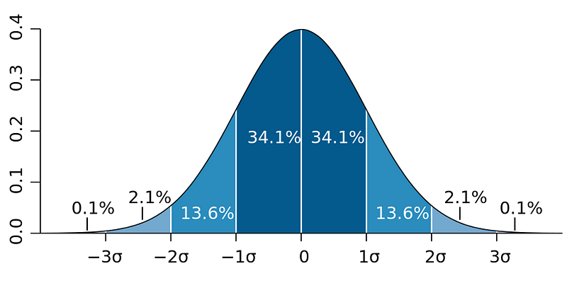
The most common after a probability is an average. There is a lot to know about averages. Same deal with low counts, you can pitch them, put confidence intervals on them, use hypothesis tests, or use priors. A most important and beautiful mathematical idea, the Central Limit Theorem, says that adding varying things together (technically independent, identically distributed random variables with finite non-zero variance) tends towards a bell curve. Since an average is adding things together (and then dividing by the number of things), a collection of averages tends towards a bell curve. There’s a lot to know about bell curves, which again I will skip for space.
Predictions
I talked about description. Now let’s talk prediction.
“It is hard to make predictions, especially about the future.” — Danish proverb
This is where software geeks get excited: regression, clustering, neural networks, decision trees, deep learning, and so on. I can’t cover it all here. The shortest story for prediction (“supervised learning”) is:
- label your data with truth (good or bad instances)
- define a model that summarizes the data to predict
- define an error (or loss) function that compares actual values to predictions on a test set (one not used for computing the model!!)
- try to make the error small
There is beauty here worthy of excitement, but it’s often a small part of the overall task. That beauty entices people to focus on this part. The rest (picking the right problem, getting and cleaning the data, ..) may affect the results more, and often takes most of the effort. Others have said this well.
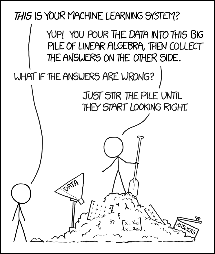
One more aggregation, this time fancier: a neural network. In one common algorithm, you hook up “neurons” in a network with inputs and outputs, present training examples as inputs, look at the outputs, and when the network is wrong, you adjust it to be more right the next time (for example with back-propagation). After presenting lots of examples, the network is a summary of the training data that will be able to accurately predict the output given the input. This is also called “deep learning” when the network is “deep”, i.e. has many layers.
I used to get cranky about neural networks and deep learning. It produces predictions, but not understanding. I believe we should seek understanding. However, when you want predictions, for certain fuzzy tasks like image or voice recognition, these techniques are so much better than any others that I have to ignore my crankiness.
Deep learning is one of the dramatic stories of our times. The ImageNet Challenge, an annual contest to detect and label objects in an image as being from a certain class (e.g., labeling an image as having a “dog” in it), has been won by deep learning systems in recent years. In 2012 classification error rates started dropping dramatically:
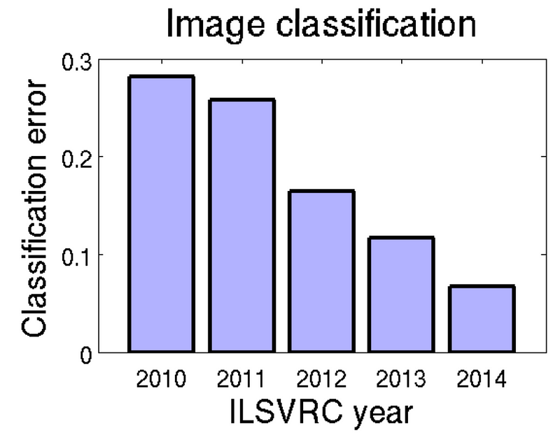
In fact, Andrej Karpathy estimated his own (human!) error in 2014 to be 5.1%, which was “beaten” by computers in 2015. (Note Karpathy says 5.1% is only a point estimate on a tradeoff curve. He knows about uncertainty. Nevertheless, a striking story.)
Other technology workhorses here have been logistic regression (which produces interpretable model coefficients) and gradient boosted decision trees (which handle non-linearities and cross-features in the data better than linear methods).
There is a lot more to say here, but I’m going to stop while the ratio of pictures to text is still high, and work on part 3.
This is part of a series. Part 0 is here.
Previous: How to become a data scientist, part 1: find a good problem
Next: How to become a data scientist, part 3: tell people about your work