Case study: explaining credit modeling predictions with SHAP
Posted on Thu 21 March 2019 in data science
Introduction
At Fiddler labs, we are all about explaining machine learning models. One recent interesting explanation technology is SHAP (SHapely Additive exPlanations). To learn more about how SHAP works in practice, we applied it to predicting loan defaults in data from Lending Club.
We built three models (random, logistic regression, and boosted trees), and looked at several feature explanation diagrams from each.
We are not financial experts, so this blog post focuses on comparing algorithms, not insights into loan data.
Hopefully, we can bring SHAP into sharper focus.

What is SHAP?
SHAP (SHapely Additive exPlanations) is a way to build a linear explanation model of feature importance for a given prediction. It works for any model, even non-linear ones like boosted trees or deep learning neural networks. Some model types (like logistic regression or trees) have a fast exact version, while for others there are tradeoffs between approximations, speed, and sampling variability.
SHAP is appealing because it is based on the Shapley values from game theory, which are the only explanations within a broad class of possibilities that satisfy three useful properties, termed by Lundberg et al.:
1. local accuracy (roughly: the explanation model matches the real model at the point being explained)
2. missingness (Lundberg: “missingness requires features missing in the original input to have no impact”)
3. consistency (Lundberg: “Whenever we change a model such that it relies more on a feature, then the attributed importance for that feature should not decrease.”)
Lundberg says consistency allows us to meaningfully compare the feature importance between two models.
We won’t further re-explain SHAP here, since that would be a post by itself. For that, see the shap library, a blog post by the author, the 2017 NIPS paper, and a nice blog post by Cody Marie Wild. Note the SHAP python library (link) generated many of the graphs in this blog post.
Also, we’ve integrated SHAP into the Fiddler Explainable AI Engine.
The data
We took a set of loans at least 3 years old that were either paid (“Fully Paid”) or in default (“Charged Off”) from Lending Club data. You can download our cleaned dataset from github (link). If you wish to look at the meaning of variable names, we used mostly a subset of the variables from this Kaggle dataset (link) with this data dictionary (link).
We also cleaned the data in a variety of ways detailed in this Jupyter notebook (for example, removing variables with missing values). Also, we removed variables not available at loan application time (e.g., total_pymnt, the total amount paid), variables from Lending Club’s own model (e.g., int_rate, the interest rate, or sub_grade, the loan grade), and issue date (which might encode general economic conditions).
We chose the first 294,520 records (in date order) as a model training set, the next 56,568 as a validation set, and the final 119,015 rows as a test set. We train on the training set, and do our analysis on the validation set. (We never use the test set in this post.)
The default rate (of “Charging Off”) is 13% in training, and 15% in the validation set.
The models
We built models to predict whether a loan was “Charged Off”, i.e. not paid in full.
We used scikit-learn 0.20.2 to run a random predictor and a logistic regression (the old linear workhorse), lightGBM 2.2.3 for boosted decision trees, and SHAP library 0.28.5.
For modeling, we took a “kitchen sink” approach (i.e., toss in most of the variables), because people are often tempted to “let the machine sort it out.” (In practice, this may not be best. Choosing variables may depend on how much data you have, what it means, what your purpose for the model is, how well your model technology can handle highly related variables, and so on.) Our models have 130 features after pre-processing.
AUC (area under an ROC curve, a common measure of prediction accuracy) was 0.5 for random (as we’d expect), and 0.68 for both logistic and lightGBM. These are not fantastically accurate models, but better than random, which is what we need for learning purposes. Also, if we could predict loan default perfectly, we’d design faster-than-light travel next!

Measuring SHAP values on the models
We got SHAP explanatory values on a subsample of the validation data for each model. Let’s walk through what that means.
We chose a 1,000-row subsample from our validation set, to speed up the time-consuming SHAP calculation.
We used shap.KernelExplainer, which uses sampling with a kernel to estimate the SHAP values, as described in the SHAP paper. Roughly: for each feature in a single row of validation data, it changes the other features to randomly chosen values from other data points (that SHAP calls the background data), weighted by a kernel function to preserve the SHAP properties. That produces a large set of data to which it fits a linear model. It is a “local” model because the linear explanation model is fit around this single row of original data.
There are other, more specific explainers for our model types: we could use shap.LinearExplainer for our logistic model, and shap.TreeExplainer for our boosted trees model. They would be faster, and produce exact values. However, for simplicity we’ll use KernelExplainer for everything. (We actually checked exact versions with slightly different parameters, and they look similar, though not the same. We might post again on this topic.)
For background data, it is slow to use the whole training dataset, so (as recommended by the library) we used shap.kmeans to create 30 representative rows from another subsample of 20,000 points from the training set.
We run that SHAP local model for each of the 1,000 rows, so we end up with 1,000 SHAP values for each feature.
Why 20,000? Why 30? Why 1,000? This is all trading off amount of data for speed, to try to estimate SHAP values in minutes instead of hours or days.
Moreover, if you look at the shap code carefully, there are a number of other choices buried in the code. For example, the l1_reg parameter of the shap_values function says auto (the default) ‘uses “aic” [to regularize feature selection] when less that 20% of the possible sample space is enumerated, otherwise it uses no regularization.’ We ended up changing the l1_reg parameter to a different version of regularization to choose 20 features, because that is what we would use for this blog post.
There are many nuances to understand, or choices to make, or perhaps defaults to accept. Such is the life of a data scientist or machine learning engineer: it’s messy putting theory into practice.
Random classifier
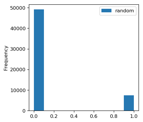
First, as a sanity check, we tried a random classifier (DummyClassifier from scikit-learn, set to the default settings including the ‘stratified’ strategy, meaning it predicts randomly with the distribution of the training data).
Below is a histogram of the predicted default probabilities, showing mostly zeros (in line with the rate of default in the training set):
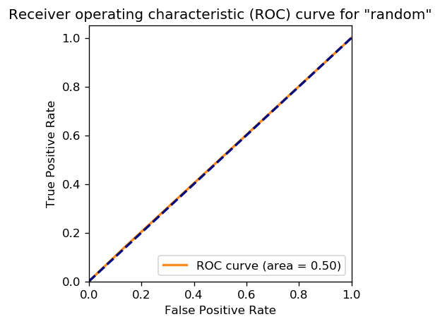
Below is an ROC curve, showing that the result are completely random (right on the diagonal). We don’t really need a graph, we could just report AUC of 0.5. However, the graph really brings it home.
Below are the mean absolute SHAP values for the 1,000 rows of our validation subsample from KernelExplainer. These are indicators of how important each feature is to prediction. The default graph shows the top 20 features.
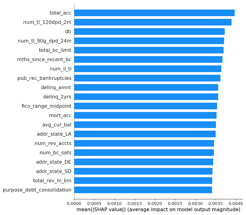
There is some variation, but as we’d expect for a random predictor, most features are of similar importance. Also, we’ll see later that these mean values are small compared to the other models.
This is what the “missingness” property of SHAP looks like in random data. Really, none of these features are important. We could hope they would show up with zero importance, but apparently that would be too much to hope for. Since this is an average of absolute values of a bunch of random things, what we get is “small and undifferentiated importance”, as long as we have enough samples.
Below is a graph of every SHAP value for every feature in each of the 1,000 rows of the validation subsample.

Here’s how you interpret this graph:
- as the feature value goes higher, the color moves from blue to red
- the X axis shows the impact on a model prediction
- the Y axis shows the feature, sorted by mean absolute SHAP value
These are the same 20 features as the previous graph, because this graph also sorts features by mean absolute SHAP value.
The graph looks to have fairly similar shapes for all the features. The tail is longer and thinner to the right than to the left, which is not an obvious outcome. It might have to do with the overall rate of default. (Note there is a visual gap in feature importances between 0 and 0.01. That is because of the regularization l1_reg parameter in shap_values that explicitly chooses the top 20 features. If we change that parameter, those gaps vanish.)
Red and blue intermingle freely, because feature values are not related to model predictions. So for any particular feature value (color), there will be some data rows with high SHAP values, and some with low SHAP values.
Logistic regression
Next we tried a logistic regression, a call to LogisticRegression that used all default values in scikit-learn 0.20.2. This is a logistic regression with some L2 regularization.
Below is a histogram of the predicted default probabilities.
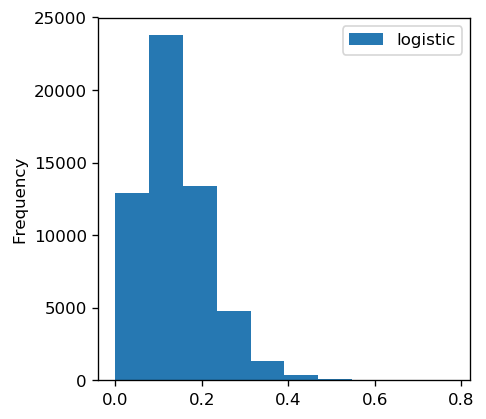
They are roughly centered around the background rate of default in the training set (13%), but occasionally the model is slightly more certain of default.
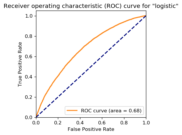
Below is an ROC curve with an AUC of 0.68, showing that the results are not completely random (since they are above the diagonal).
For logistic regression, the SHAP overall (mean absolute) feature impact should be similar to the logistic regression coefficients.
Another way to think of this is that “local” explanations (SHAP linear approximations of model predictions around each data point) and “global” explanations (model coefficients) should be similar, although some factors will prevent an exact match, e.g., l1 regularization of the features (see the notebook).
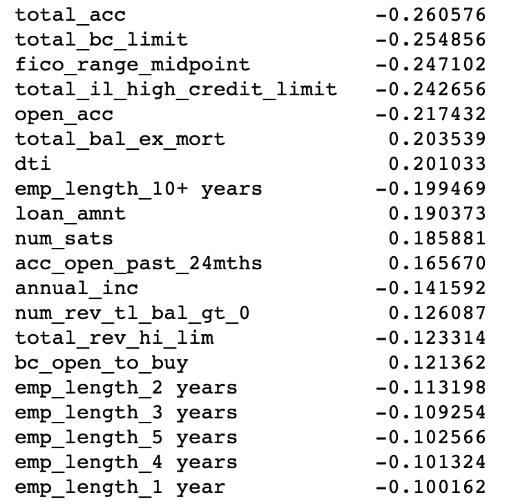
Let’s look at regression coefficients versus SHAP values. Below are the regression coefficients.
Below are the SHAP importance values. We use the link=’logit’ parameter of KernelExplainer to make the feature values log-odds units, hence more comparable to the logistic regression. (An identity link function might be more human-interpretable because it is in probability units, but would likely match the logistic coefficients more poorly.)
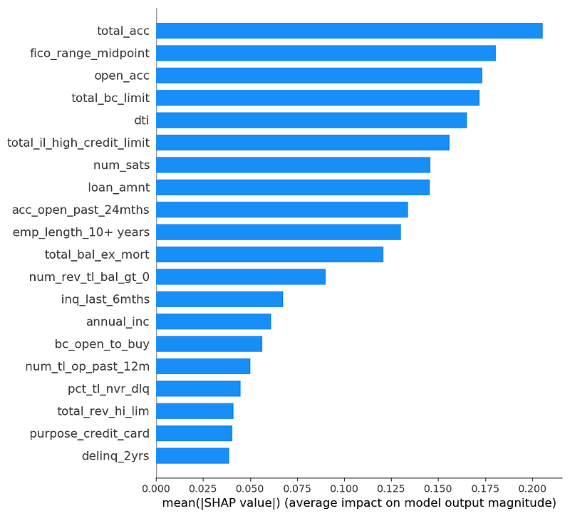
First, the explanations agree a lot: 15 of the top 20 variables are in common between the top logistic regression coefficients and the SHAP features with highest mean absolute SHAP values. Below is a graph comparing these values for the top 20 logistic coefficients:
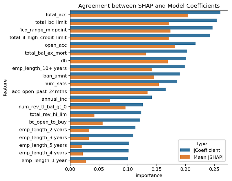
Second, the values are often similar in magnitude, though not the same. For example, the absolute value of the total_bc_limit coefficient is about 0.25 in the logistic fit, and the SHAP mean absolute importance value looks to be about 0.18.
In fact, the SHAP importance values all seem a bit lower than the absolute values of the logistic coefficients. Perhaps the regularized logistic regression and SHAP treat collinear (highly related) features slightly differently. Or perhaps the multiple levels of sampling in SHAP (both in the subsample we chose, and in the feature values chosen per data row) shift things around a bit.
We looked at a subsample of size 2,000 instead of 1,000, to see if the SHAP values would shift a lot. Below are a graph of those values.
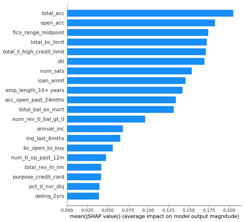
They don’t shift much. Between a subsample of 1,000 and 2,000, all 20 variables are the same, in almost the same order, with almost the same magnitude. That gives us confidence that these values are stable.
Now let’s look at a more detailed display that shows SHAP values for the 1,000 points in our subsample of the validation set.
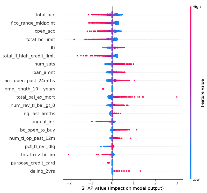
Let’s look at the top feature: total_acc. If the feature value is low (blue), the model prediction (probability of default) tends to be higher (X value is positive). I don’t know this data well enough to understand why having more accounts would make you less likely to default. Perhaps people who are trying to consolidate their debt have a lot of accounts at application time, and those people are more likely to pay off their consolidation loan? Or, perhaps this feature is highly correlated to another feature that predicts risk and the model has decided to use this feature to cancel out the effects of that other feature. The open_acc feature is similar.
The feature ‘fico_range_midpoint’ makes more sense to me. It represents the applicant’s credit score at time of application. If credit score is higher (red), predicted probability of default goes down (X value is negative).
Several other observations:
1. Looking at data instead of averages shows that some features (e.g., total_bc_limit with its long tail) have more outliers in SHAP values than other features (e.g., dti, with its squat shape).
2. SHAP effects are monotonic for a linear model: the color always goes smoothly from one color to the other across the graph. (Logistic regression is linear enough.)
3. Integer-valued features (like acc_open_past_24_mths or delinq_2yrs) map to evenly spaced SHAP values for a linear model
4. We can see indicator variables (e.g., “emp_length_10+ years”). Features with a smaller SHAP value impact (e.g., “emp_length_10+ years”) may have a higher overall (mean absolute) impact if they occur more often, compared to a larger impact but more rare (like purpose_credit_card).
5. Many features look to have small impact, but with a long tail.
lightGBM (boosted trees)
Now let’s look at boosted trees. We make a plain vanilla default call to lightgbm.train in lightGBM 2.2.3. Now there is no easily summarized global explanation like “coefficients.”
Below is a graph of the predicted default probabilities.
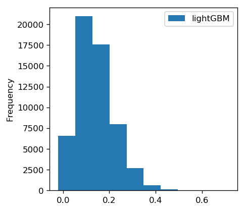
As with the logistic model, these values are roughly centered around the probability of default in the training data.
Below is an ROC curve with an AUC of 0.68, showing that the results are not completely random (above the diagonal). We didn’t gain much over logistic in this case.

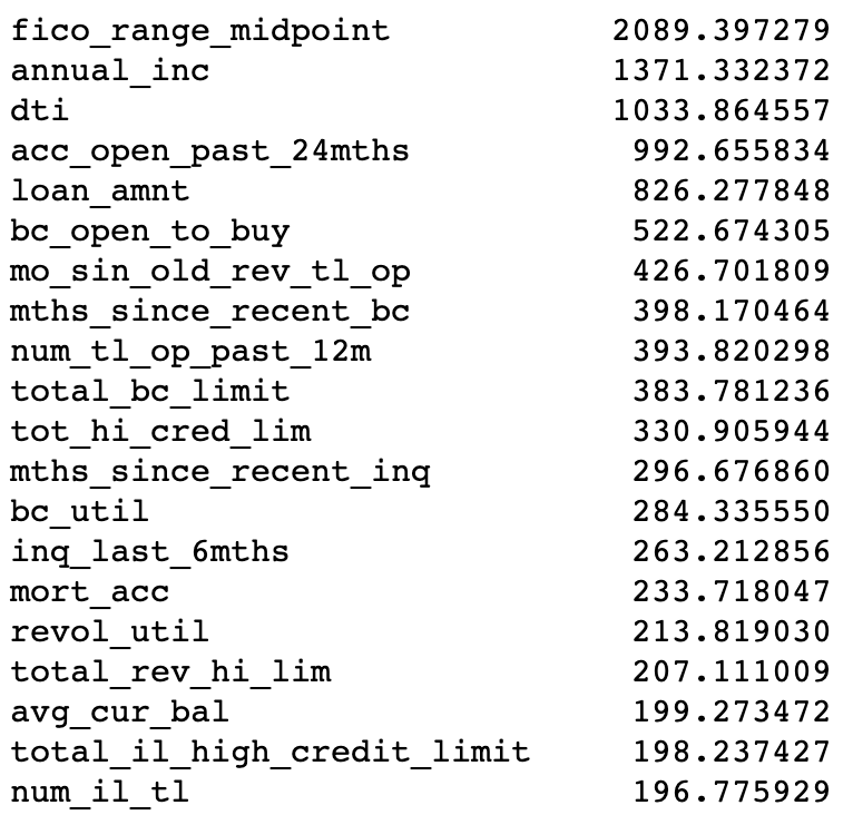
Below is a list of lightGBM feature importances, as reported by the feature_importance function, with importance_type=’gain’.
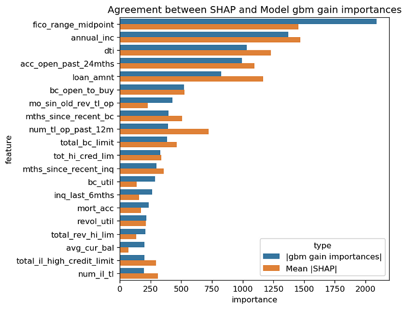
And below is a graph of SHAP feature importances (mean absolute SHAP value).
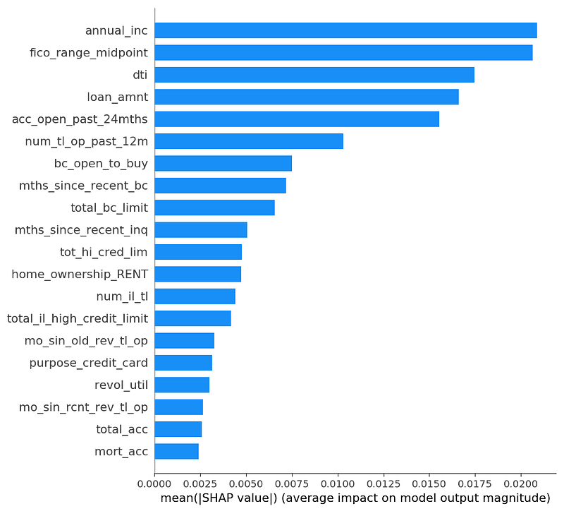
Lundberg (the inventor of SHAP) explains that SHAP values disagree with information gain in his blog post about XGBoost, and why he trusts SHAP. In short, information gain attributes importance inconsistently when Lundberg makes a small change to a toy model (making “cough” +10 in the red model), because information gain gives more weight to nodes lower in the tree, when it should do the opposite (root nodes are more important).
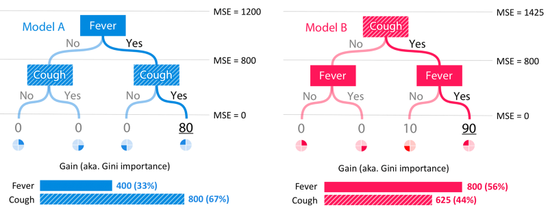
After all that discussion of why they might be different, these SHAP mean absolute values agree surprisingly well with the lightGBM information gain. Below is a chart where we scale SHAP values to be visually comparable to the information gain values. The relative values of the features look quite similar. (Note: we have seen other data where this is not true.)
Below is a graph of all the SHAP values of a 1,000-row subsample of the validation set.
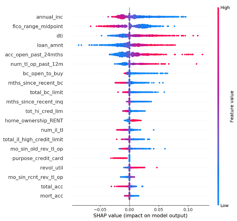
First, not all the features are monotonic. That is, the color doesn’t slide uniformly from red to blue. For example, if you look closely, the top feature annual_inc is a mixed cloud of blue and red for negative values. If I were working on this problem for real, I’d want to dig into that. It could be that there are different types of loan applications, for example dividing into quadrants: feature low/SHAP low, feature low/SHAP high, feature high/SHAP low, feature high/SHAP high.
However, many features are still monotonic. For example, high fico_range_midpoint (red) means a lower probability of default (X axis negative). Or dti (debt-to-income ratio), a feature people expect to be monotonically correlated to default rate, and it is (mostly).
(Side note: the average absolute SHAP values for boosted trees are an order of magnitude lower than those for logistic regression. This is because we ran logistic SHAP with a logit link function in order to make the SHAP values comparable to the logistic regression, but we ran the boosted trees SHAP without a logit link function.)
Below is the same graph, but on a 2,000-row subsample.
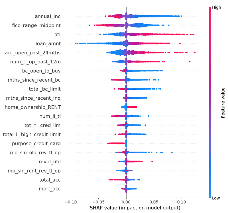
It is very similar-looking to the 1,000-row subsample. All top 20 variables are the same (with a couple of swaps in order). All the graphs look substantially graphically similar. This again gives us confidence that these measurements are stable.
Comparing logistic regression and boosted trees
Logistic regression and boosted trees had similar accuracy, an AUC of 0.68. Their predicted values also agree (correlation coefficient of 0.86).
However, their SHAP values don’t agree, likely because we used a logit link function for logistic but not boosted trees.
Summary
We looked at explanations for three models to predict defaults in loan data.
In the two models that are easier to globally understand, SHAP mostly matched our expectations.
- Explanations for a random model show that no features stand out. All features contribute similar small amounts to the predictions.
- Explanations for a logistic regression model show features that mostly correspond to the global regression coefficients.
In the case of boosted trees (a non-linear model), we had fewer expectations about what SHAP would say about the features. As it turned out, the logistic and boosted trees model do agree on feature importance, but not SHAP values, because we used different link functions for logistic regression and boosted trees.
Also, the detailed dataset SHAP values diagram added more to our understanding of each feature: we could see which features were monotonic and which were not; we could see long tails and the relative importance and strength of indicator variables; and so on.
Finally, we looked at one way to investigate the stability of SHAP by eye: compute a larger sample, and see if SHAP feature summary values look stable.
In conclusion: SHAP helps explain the features most important to model predictions, but there is still a lot of nuance to understanding and using it correctly.
Thanks to Peter Skomoroch, Luke Merrick and Scott Lundberg for their feedback.