A gentle introduction to GA2Ms, a white box model
Posted on Mon 03 June 2019 in data science
This post is a gentle introduction to a white box machine learning model called a GA2M.
We’ll walk through:
- What is a white box model, and why would you want one?
- A classic example white box model: logistic regression
- What is a GAM, and why would you want one?
- What is a GA2M, and why would you want one?
- When should you choose a GAM, a GA2M, or something else?
The purpose of all these machine learning models is to make a prediction towards a goal specified by a human. Think of a model that can predict loan default, or the presence of someone’s face in a picture.
The short story: A generalized additive model (GAM) is a white box model that is more flexible than logistic regression, but still interpretable. A GA2M is a GAM with interaction terms, which allows it to be more flexible still, but with a more complicated interpretation. GAMs and GA2Ms are an intriguing addition to your toolbox, interpretable at the expense of not fitting every kind of data. A picture:

For more about what that all means, read on.
White box models
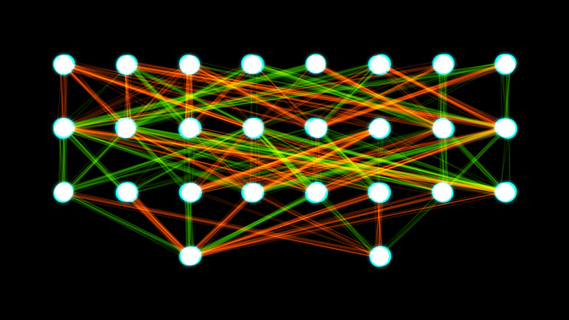
The term “ white box” comes from software engineering. It means software whose internals you can view, compared to a “black box” whose internals you cannot view. By this definition, a neural network could be a white box model if you can see the weights (picture credit):

However, by white box people really mean something they can understand. A white box model is a model whose internals a person can see and reason about. This is subjective, but most people would agree the weights shown above don’t give us information about how the model works in such a way as we could usefully describe it, or predict what the model is going to do in the future.
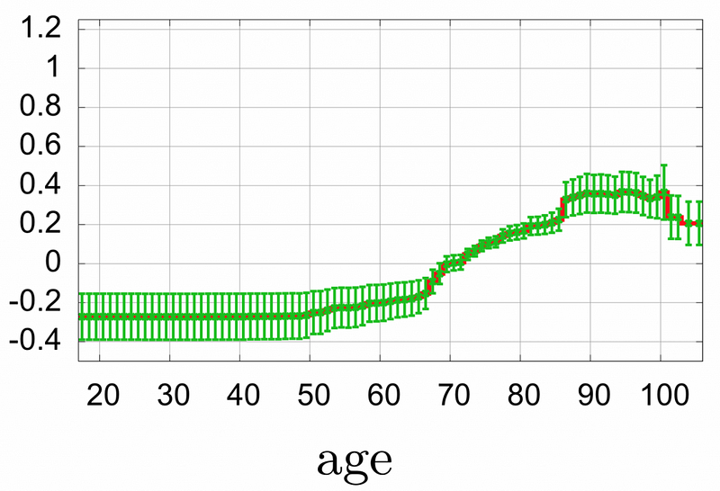
Compare the picture above to this one about risk of death from pneumonia by age from [1]:

Now that isn’t a whole model. Rather, it’s the impact of one feature (age) on the risk score. The green lines are error bars (±1 standard deviation in 100 rounds of bagging). The red line in the middle of them is the best estimate. In the paper, they observe:
- Risk score is flat until about age 50. Risk score here is negative, meaning less risk of death than the average in the dataset.
- Risk score rises sharply at 65. This could be due to retirement. In future, it might be interesting to gather data about retirement.
- The error bars are narrowest in ages 66–85. Perhaps that is where the most data is.
- Risk score rises again at 85. The error bars also widen again. Maybe this jump is not real.
- Risk score drops above 100. This may be due to lack of data, or something else. In the paper, they suggested one might wish to “fix” this region of the model by changing it to predict at the same level as ages 85–100 instead of dropping. This fix is using domain knowledge (“risk of pneumonia likely doesn’t go down after age 85”) to address possible model artifacts.
- Risk score between 66 and 85 is relatively flat.
All this from one graph of one model feature. There are facts, like the shape of the graph, and then speculation about why the graph might behave that way. The facts are useful to understand the data. The speculation cannot be answered by any tool, but may be useful to suggest further actions, like collecting new features (say, about retirement) or new instances (like points below age 50 or above 100), or new analyses (like looking carefully at data instances around ages 85–86 for differences).
These aren’t simulations of what the model would do. These are the internals of the model itself, so that graph is accurately describing the exact effect of age on risk score. There are 55 other components to this model, but each can be examined and reasoned about.
This is the power of a white box model.
This example also shows the dangers. By seeing everything, we may believe we understand everything, and speculate wildly or “fix” inappropriately. As always, we have to exercise judgment to use data properly.
In summary: make a white box model to
- learn about your model, not from simulations or approximations, but the actual internals
- improve your model, by giving you ideas of directions to pursue
- “fix” your model, i.e., align it with your intuition or domain knowledge
One final possibility: regulations dictate that you need to fully describe your model. In that case, it could be useful to have human-readable internals for reference.
Here are some examples of white box and black box models:
White box models
- Logistic regression
- GAMs
- GA2Ms
- Decision trees (short and few trees)
Black box models
- Neural networks (including deep learning)
- Boosted trees and random forests (many trees)
- Support vector machines
Now let’s walk through three specific white box models.
A classic: logistic regression
Logistic regression was developed in the early 1800s, and re-popularized in the 1900s. It’s been around for a long time, for many reasons. It solves a common problem (predict the probability of an event), and it’s interpretable. Let’s explore what that means. Here is the logistic equation defining the model:

There are three types of variables in this model equation:
- p is the probability of an event we’re predicting. For example, defaulting on a loan
- The x’s are features. For example, loan amount.
- The 𝛽’s (betas) are the coefficients, which we fit using a computer.
The betas are fit once to the entire dataset. The x’s are different for each instance in the dataset. The p represents an aggregate of dataset behavior: any dataset instance either happened (1) or didn’t (0), but in aggregate, we’d like the right-hand side and the left-hand side to be as close as possible.
The “log(p/(1-p))” is the log odds, also called the “logit of the probability”. The odds are (probability the event happened)/(probability the event won’t happen), or p/(1-p). Then we apply the natural logarithm to translate p, which takes the range 0 to 1, to a quantity which can range from -∞ to +∞, suitable for a linear model.
This model is linear, but for the log odds. That is, the right-hand side is a linear equation, but it is fit to the log odds, not the probability of an event.
This model is interpretable as follows: a unit increase in xi is a log-odds increase in 𝛽i.
For example, suppose we’re predicting probability of loan default, and our model has a feature coefficient 𝛽1=0.15 for the loan amount feature x1. That means a unit increase in the feature corresponds to a log odds increase of 0.15 in default. We can take the natural exponent to get the odds ratio, exp(0.15)=1.1618. That means:
for this model, a unit increase (of say, a thousand dollars) in loan amount corresponds to a 16% increase in the odds of loan default, holding all other factors constant.
This statement is what people mean when they say logistic regression is interpretable.
To summarize why logistic regression is a white box model:
- The input response terms (𝛽i*xi terms) can be interpreted independently of each other
- The terms are in interpretable units: the coefficients (betas) are in units of log odds.
So why would we use anything other than the friendly, venerable model of logistic regression?
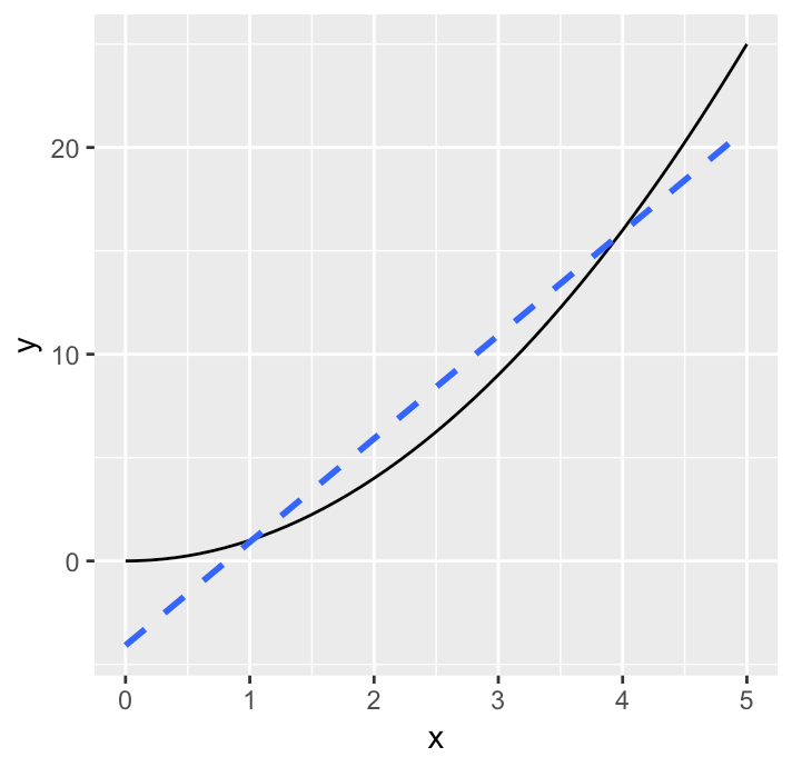
Well, if the features and log odds don’t have a linear relationship, this model won’t fit well. I always think of trying to fit a line to a parabola:

If you have non-linear data (the black parabola), a linear fit (the blue dashed line) will never be great. No line fits the curve.
Generalized Additive Models (GAMs)
Generalized Additive Models (GAMs) were developed in the 1990s by Hastie and Tibshirani. (See also chapter 9 of their book “ The Elements of Statistical Learning “.) Here is the equation defining the model:

This equation is quite similar to logistic regression. It has the same three types of elements:
- E(Y) is an aggregate of dataset behavior, like the “p” in the equation above. In fact, it may well be the probability of an event, the same p.
- g(.) is a link function, like the logit (or log odds) from the logistic equation above.
- fi(xi) is a term for each dataset instance feature x1,…,xm.
The big difference is instead of a linear term 𝛽i*xi for a feature, now we have a function fi(xi). In their book, Hastie and Tibshirani specify a “smooth” function like a cubic spline. Lou et al. [2] looked at other functions for the fi, which they call “shape functions.”
A GAM also has white box features:
- The input response terms (f(xi) terms) can be interpreted independently of each other
- The terms are in interpretable units. For the logit link function, these are log odds.
Now a term, instead of being a constant (beta), is a function, so instead of reporting the log odds as a number, we visualize it with a graph. In fact, the graph above of pneumonia risk of death by age is one term (shape function) in a GAM.
So why would we use anything other than a GAM? It’s already flexible and interpretable. Same reason as before: it might not be accurate enough. In particular, we’ve assumed that each feature response can be modeled with its own function, independent of the others.
But what if there are interactions between the features? Several black box models (boosted trees, neural networks) can model interaction terms. Let us walk through a white box model that also can: GA2Ms.
GAMs with interaction terms (GA2Ms)
GA2Ms were investigated in 2013 by Lou et al. [3]. The authors pronounce them with the letters “gee ay two em”, but in house we’ve taken to calling them “interaction GAMs” because it’s more pronounceable. Here is the model equation:

This equation is quite similar to the GAM equation from the previous section, except it adds functions that can account for two feature variables at once, i.e. interaction terms.
Microsoft just released a library InterpretML that implements GA 2Ms in python. In that library, they call them “Explainable Boosting Machines.”
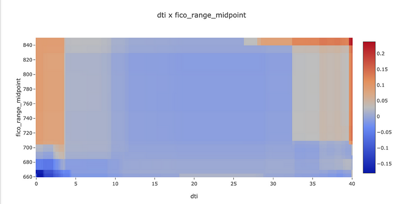
Lou et al. say these are still white box models because the “shape function” for an interaction term is a heatmap. The two features are along the X and Y axis, and the color in the middle shows the function response. Here is an example from Microsoft’s library fit to predicting loan default on a dataset of loan performance from lending club:

For this example graph:
- The upper right corner is the most red. That means the probability of default goes up the most when dti (debt to income ratio) and fico_range_midpoint (the FICO credit score) are both high.
- The left strip is also red, but turns blue near the bottom. That means that very low dti is usually bad, except if fico_range_midpoint is also low.
This particular heatmap is hard to reason about. This is likely only the interaction effect without the single-feature terms. So, it could be that the probability of default overall isn’t higher at high-dti and high-fico, but rather just higher than either of the primary effects predict by themselves. To investigate further, we could probably look at some examples around the borders. But, for this blog post, we’ll skip the deep dive.
In practice, this library fits all single-feature functions, then N interaction terms, where you pick N. It is not easy to pick N. The interaction terms are worthwhile if they add enough accuracy to be worth the extra complexity of staring at heatmaps to interpret them. That is a judgement call that depends on your business situation.
When should we use GAMs or GA2Ms?
To perform machine learning, first pick a goal. Then pick a technology that will best use your data to meet the goal. There are thousands of books and millions of papers on that subject. But, here is a drastically simplified way to think about how GA2Ms fit in to possible model technologies: they are on a spectrum from interpretability to modeling feature interactions.
- Use GAMs if they are accurate enough. It gives the advantages of a white box model: separable terms with interpretable units.
- Use GA2Ms if they are significantly more accurate than GAMs, especially if you believe from your domain knowledge that there are real feature interactions, but they are not too complex. This also gives the advantages of a white box model, with more effort to interpret.
- Try boosted trees (xgboost or lightgbm) if you don’t know a lot about the data, since it is quite robust to quirks in data. These are black box models.
- When features interact highly with each other, like pixels in images or the context in audio, you may well need neural networks or something else that can capture complex interactions. These are deeply black box.
In all cases, you may well need domain-specific data preprocessing, like squaring images, or standardizing features (subtracting the mean and dividing by the standard deviation). That is a topic for another day.
Now hopefully the diagram we started with makes more sense.

At Fiddler Labs, we help you explain your AI. Email us at [email protected].
References
- Caruana, Rich, Yin Lou, Johannes Gehrke, Paul Koch, Marc Sturm, and Noemie Elhadad. “Intelligible Models for HealthCare: Predicting Pneumonia Risk and Hospital 30-Day Readmission.” In Proceedings of the 21th ACM SIGKDD International Conference on Knowledge Discovery and Data Mining, 1721–1730. KDD ’15. New York, NY, USA: ACM, 2015. https://doi.org/10.1145/2783258.2788613.
- Lou, Yin, Rich Caruana, and Johannes Gehrke. “Intelligible Models for Classification and Regression.” In Proceedings of the 18th ACM SIGKDD International Conference on Knowledge Discovery and Data Mining, 150–158. KDD ’12. New York, NY, USA: ACM, 2012. https://doi.org/10.1145/2339530.2339556.
- Lou, Yin, Rich Caruana, Giles Hooker, and Johannes Gehrke. Accurate Intelligible Models with Pairwise Interactions, 2017. https://www.microsoft.com/en-us/research/publication/accurate-intelligible-models-pairwise-interactions/.
Originally published at https://blog.fiddler.ai on June 3, 2019.